
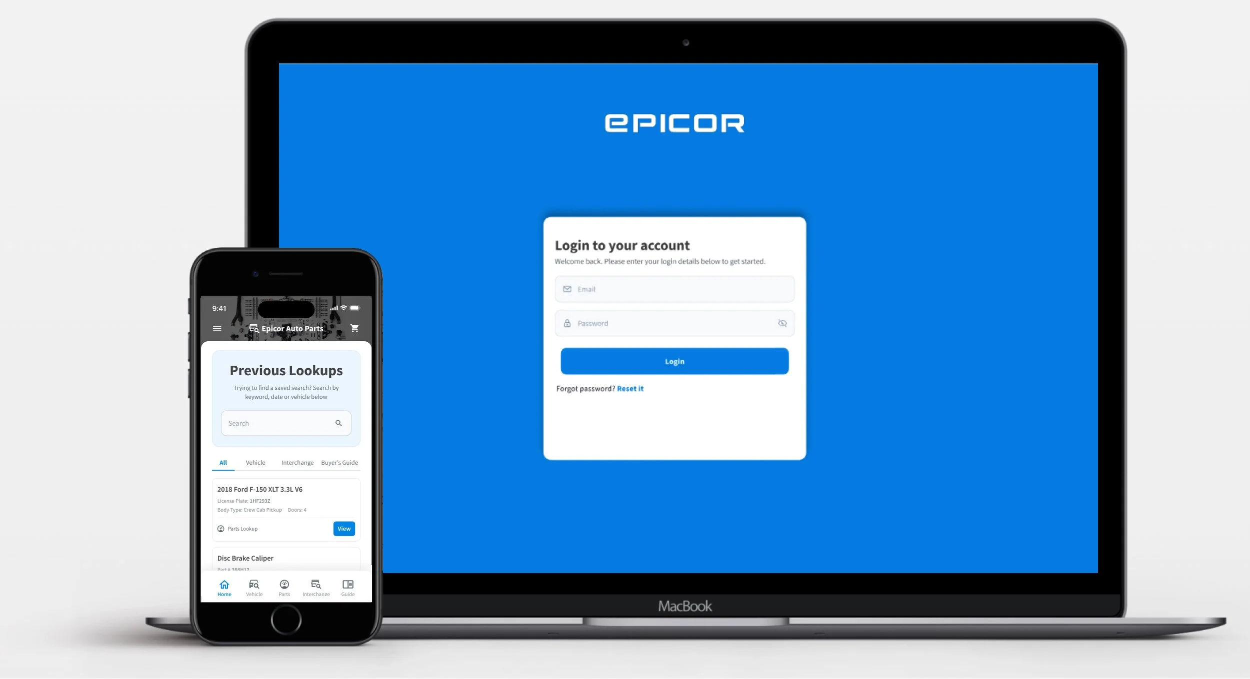
Reimagining an automotive parts catalog for the next generation
Epicor
About
The backbone of the aftermarket auto parts supply chain
The Auto Parts eCatalog is a platform used throughout the aftermarket supply chain. Due to increased customer demand, the existing catalog design was no longer keeping pace. A new and improved experience was needed.
The new design would use advanced technology to deliver faster performance, richer features, and a modern experience that meets both current supply chain needs and evolving customer preferences.
The Problem
An outdated catalog failing a new generation of users
The existing eCatalog was built for a different era. Younger generations entering the workforce expected modern, mobile-friendly software comparable to the retail apps they used daily. The platform could not deliver. It was slow, inflexible, and could not handle the growing data demands of the aftermarket supply chain.
Problem Statements
- How might we design a user-friendly interface that combines parts and labor estimation into a seamless experience?
- How might we optimize performance to achieve speeds comparable to or surpassing traditional retail catalogs?
- How might we enhance the system's capability to handle large amounts of data without interruptions?

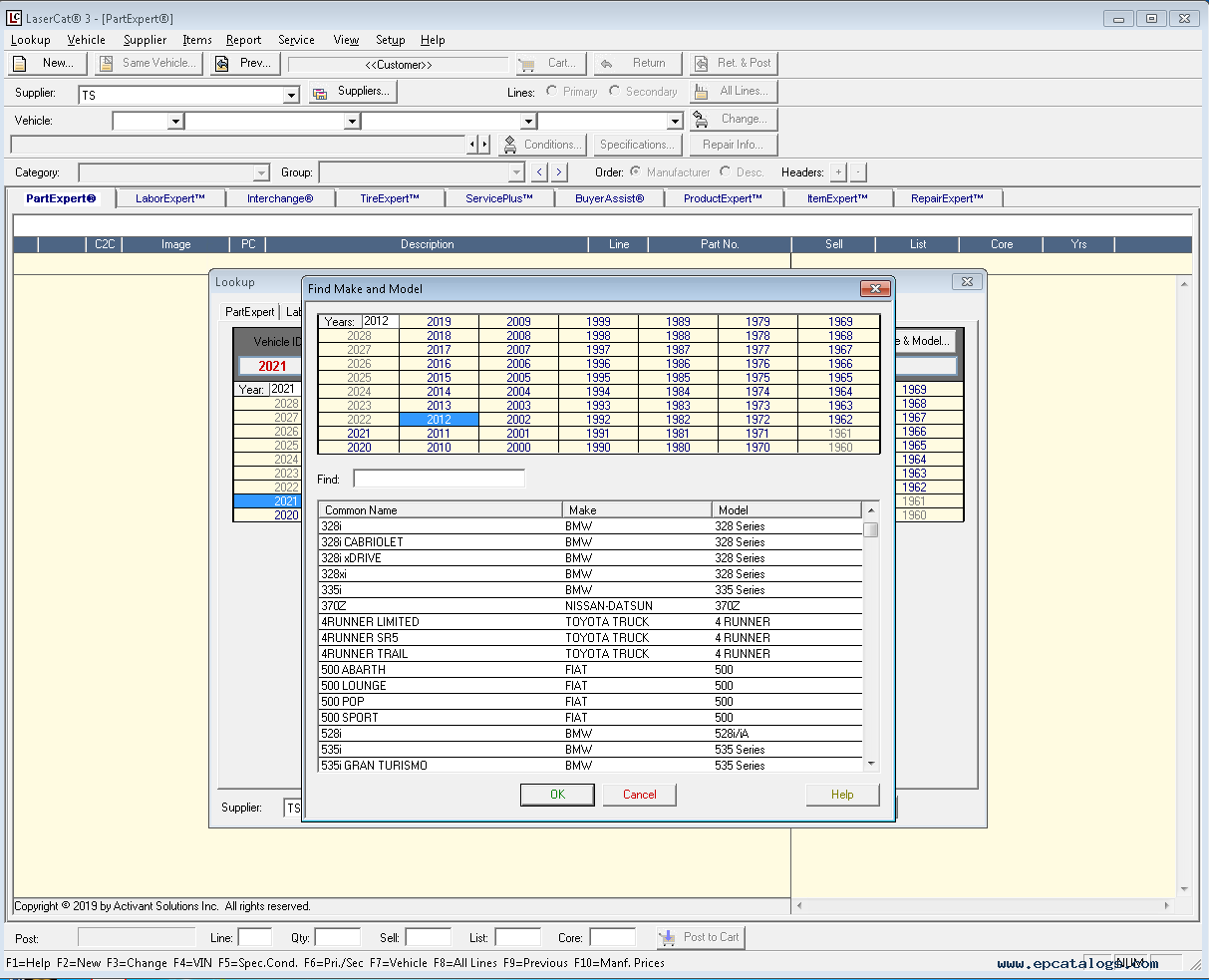
Outdated design
The platform looked and felt old, failing to meet the expectations of younger users entering the workforce who were accustomed to modern retail apps.
Not mobile-friendly
Both mobile and desktop platforms lacked responsiveness, leading to numerous usability issues and a degraded experience across all devices.
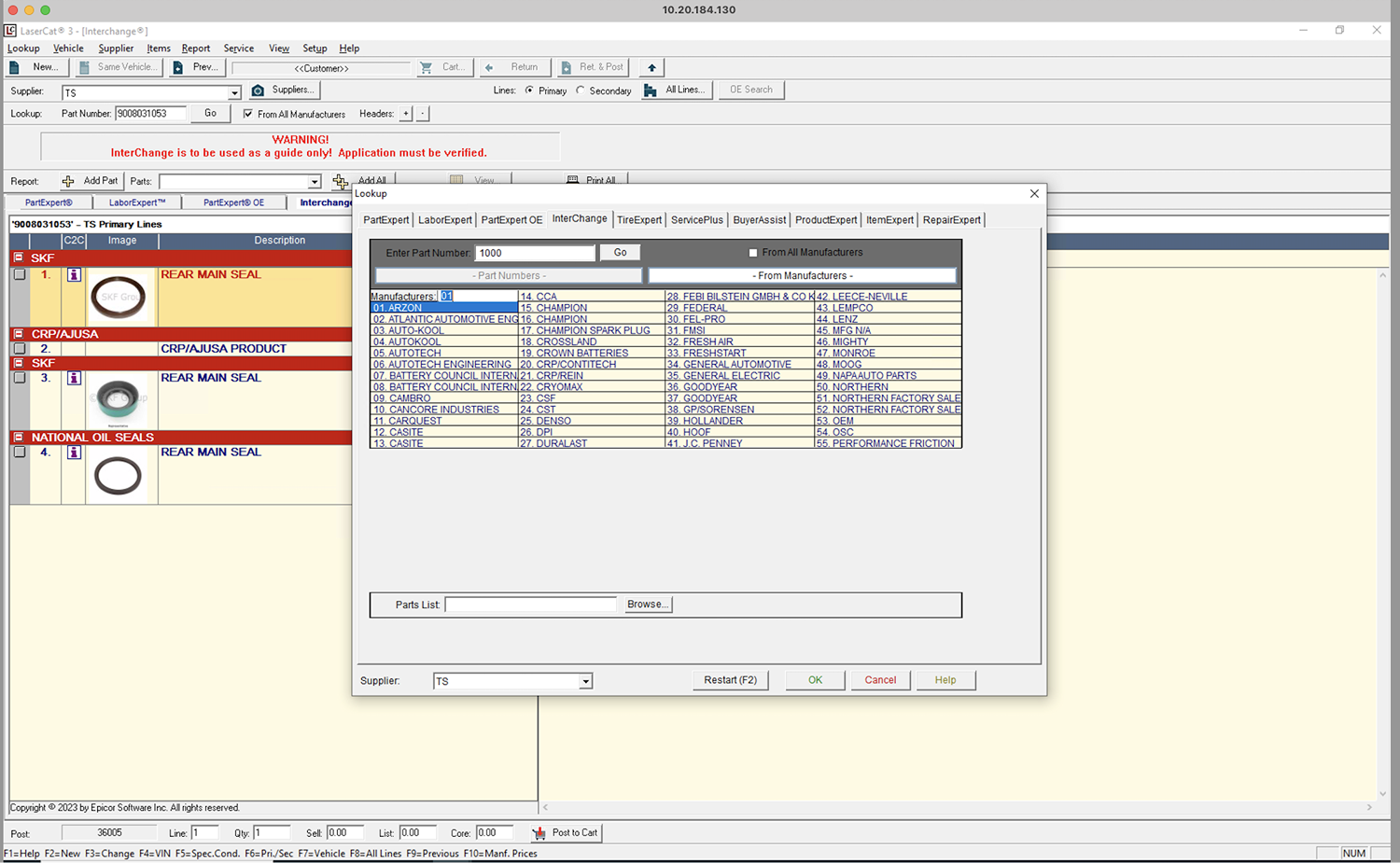
Slow performance
System speed fell short of commonly used retail catalogs, creating daily frustration and lost productivity for counter staff.

Poor data handling
The system could not manage large data sets gracefully, causing frequent disruptions when users needed to find parts quickly.
Discovery
Understanding users before designing solutions
During the discovery phase, our team identified key reasons for undertaking this redesign. The primary motivation was not only the outdated nature of the existing application but also its failure to effectively communicate to its audience. Through user research, we uncovered specific pain points that served as a critical foundation for developing a more user-centric solution.
Qualitative Research
We conducted interviews with representative customers from two key accounts, Canadian Tire and XL Parts, with a total of 5 participants guided by a structured set of questions.
Users could interact with the product without issues
Users preferred the old look and resisted change
Found the existing eCatalog easy to navigate
Wished the catalog had more filtering options
What users told us
"Looking for modern look software"User 1
"I wish the eCatalog had more filters"User 2
"Handle large data sets gracefully"User 3
Key findings
- Users expect a modern experience, particularly younger generations accustomed to phone and tablet interfaces
- Users want to estimate parts and labor from the same interface
- Users want the ability to visually demonstrate work to customers
- System speed is slower compared to commonly used retail catalogs
- The system does not handle large data sets gracefully
Personas
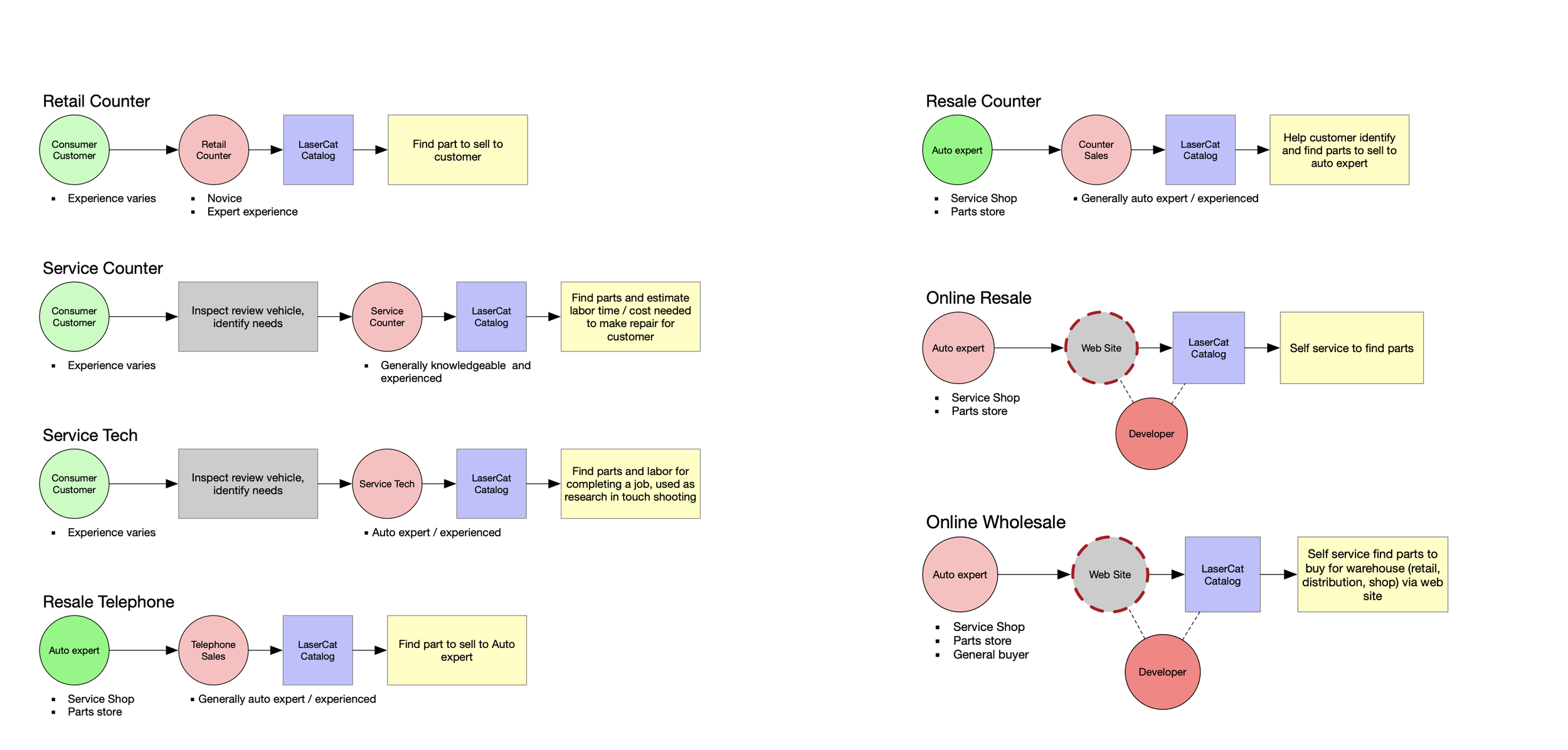
For the first release, we developed two personas to guide design decisions: the retail counter user and the service counter user.
Ideation
Brainstorming a smarter path to parts
In the initial stages, I ran brainstorming and whiteboarding sessions with the product manager to identify essential features, distinguishing between need-to-have and good-to-have. I also collaborated closely with the development team to understand the technical capabilities and constraints of the existing product.
Based on this, I formulated a hypothesis: implementing a flow that lets users first select their vehicle and then choose a category, or skip directly to a category, would significantly improve the experience by streamlining how users find the parts they need.
Proposed user flow
To elevate user experience, we introduced a dynamic flow that empowers users with seamless navigation. Users can select their vehicle before transitioning to the Category/Type/Group screen, or go directly to a category, whichever path fits their workflow.

Part type selection flow
User feedback and usability testing were crucial in validating the implementation of part type selection. We ran focus groups and one-on-one sessions, gathering insights on how users navigated two distinct paths. Feedback was overwhelmingly positive. Users found the interface simplified and accelerated their workflow.

Usability test insights
- No option to select a vehicle by license plate or VIN. Added YMME, License Plate, and VIN lookup.
- System fell short in managing substantial data volumes without disruption
- Both mobile and desktop lacked responsiveness, leading to a degraded experience across devices
- Users needed more subcategories and advanced filters to find parts quickly
Iteration
Redesign applying user insights
The redesign applied every insight from discovery and testing. The header tab feature allows users to find their vehicle via the traditional or a new streamlined path. By selecting a category type directly, users can locate the specific part they need without going through the old multi-step process.

Users choose their vehicle by YMME, VIN, or license plate, then navigate to the category and part type. This path suits users who know their vehicle but are browsing available parts.

Users go directly to a part category without selecting a vehicle first. Ideal for counter staff who already know what part they need and want the fastest route to it.
Engineering collaboration
I documented extensive specifications covering accessibility, dynamic type support, long value handling, edge cases, error states, and interaction deltas between old and updated experiences. I collaborated with engineers early and often to understand technical feasibility, and routinely QA tested builds to ensure high-quality implementation.
The Outcome
Faster transactions, happier users, stronger teams
The redesigned eCatalog delivered measurable improvements across the board, from transaction speed to staff productivity. The project also demonstrated the value of user-centered design in a complex supply chain context.
Biggest takeaways
- User-Friendly Virtual Kit Inventory Develop a feature that displays the availability of individual parts within a kit, allowing users to determine if all components are in stock without switching screens or manually typing part numbers.
- Advanced Filtering and Subcategories Enhance search functionality with additional subcategories and advanced filtering, enabling users to quickly find multiple products, access interchange coverage, look up older vehicles, and locate products at remote branches.
