
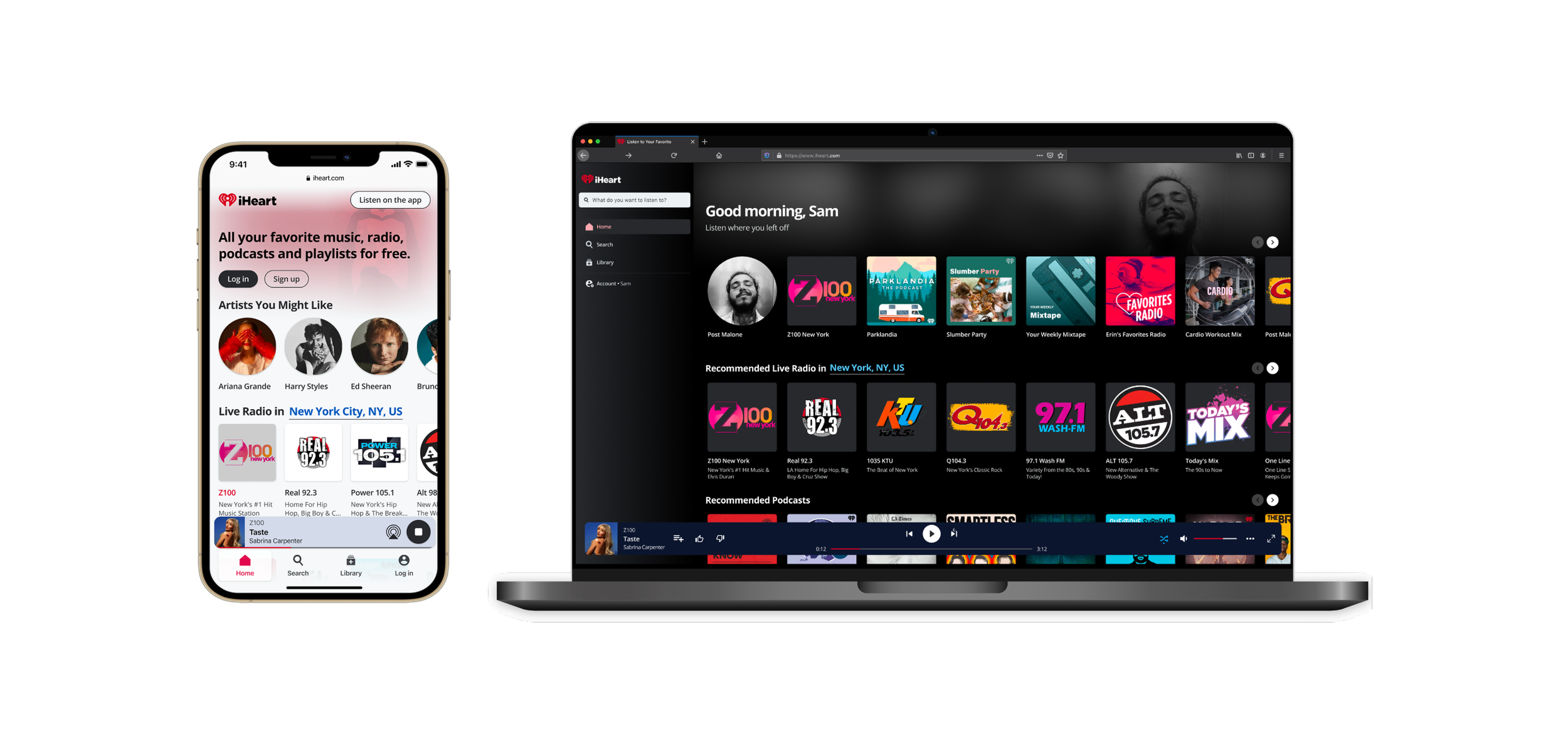
iHeartRadio Web Platform Redesign
iHeartMedia
The Challenge
A platform serving millions that wasn't working for anyone
With 3.7 million unique visitors and 39.7 million total listening hours, iHeartRadio's web platform had the audience. What it didn't have was an experience worth staying for. Usability issues, outdated navigation, and a fragmented design system were pushing users away before they could engage.
Unique visitors
Total listening hours
New users monthly
Mobile usage
Research and Discovery
The data told a clear story
We ran quantitative analysis, user interviews with 5 participants, surveys with 60 participants, and task-based testing with 500 users. The patterns were consistent.
Of users never log into the app
Landing page engagement across 70MM unique visitors
User complaints about episode search
Search engagement rate
What users told us
- They listened to iHeart in the background and never explored beyond that
- Search felt broken — users couldn't find what they were looking for
- They wanted access to live events but couldn't find them easily
- Most preferred listening without an account, which the platform didn't support well

Process
Rethinking navigation from the ground up
The process was iterative and collaborative — grounded in research, shaped by design critiques with stakeholders, and validated with real users at every step. I led both design and project management, keeping the team aligned across research, design, and engineering.
Information Architecture
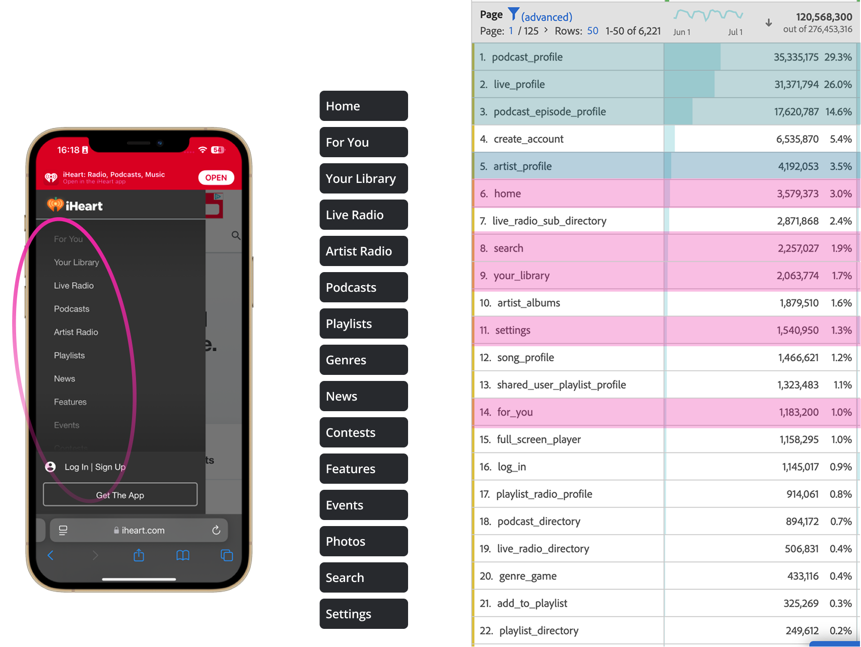
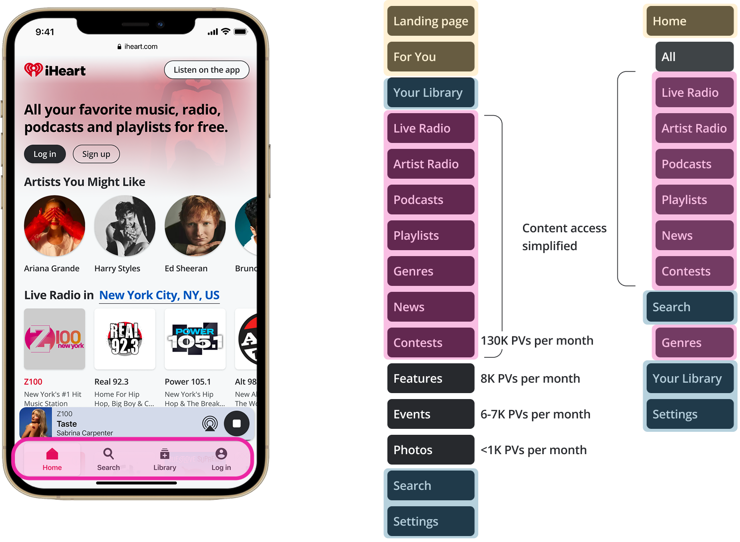
The old navigation had 15 content tabs with hidden discovery and no clear hierarchy. We replaced it with a behavioral, task-oriented structure that exposed navigation and prioritized what users actually came to do. Task completion dropped from 12 seconds to 7 seconds.
Before
After
Final Experience
A platform users actually want to come back to
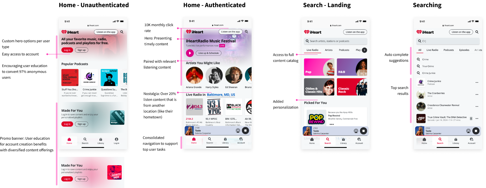
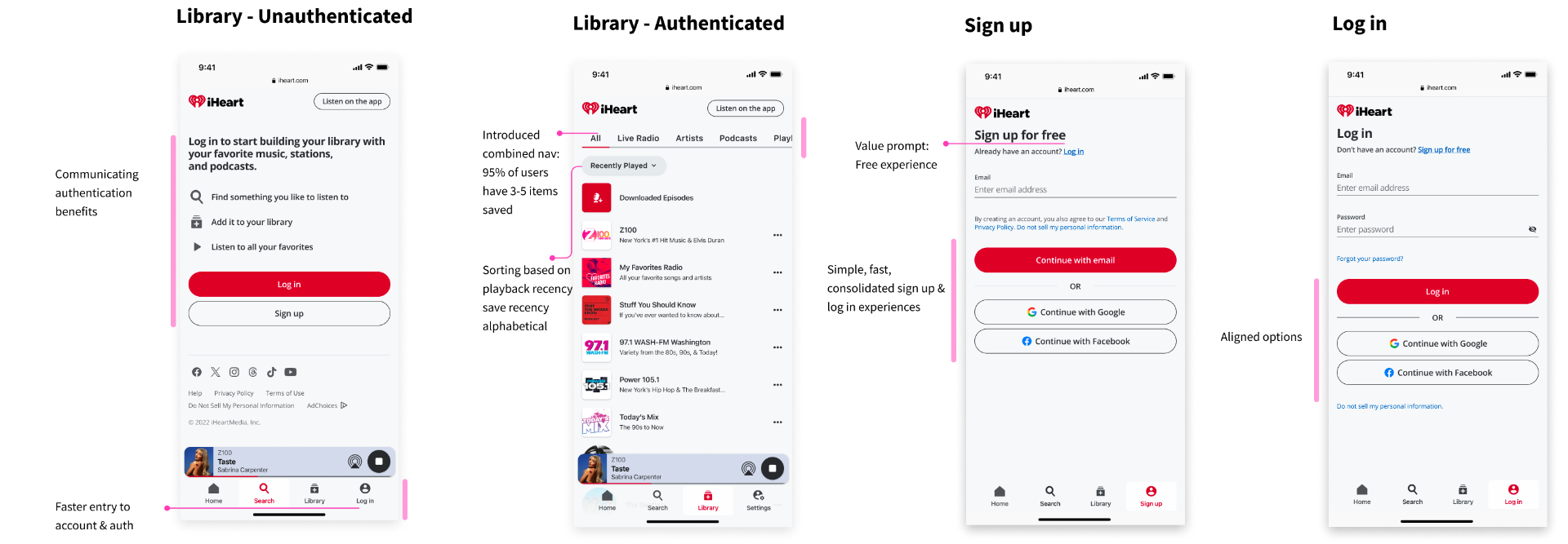
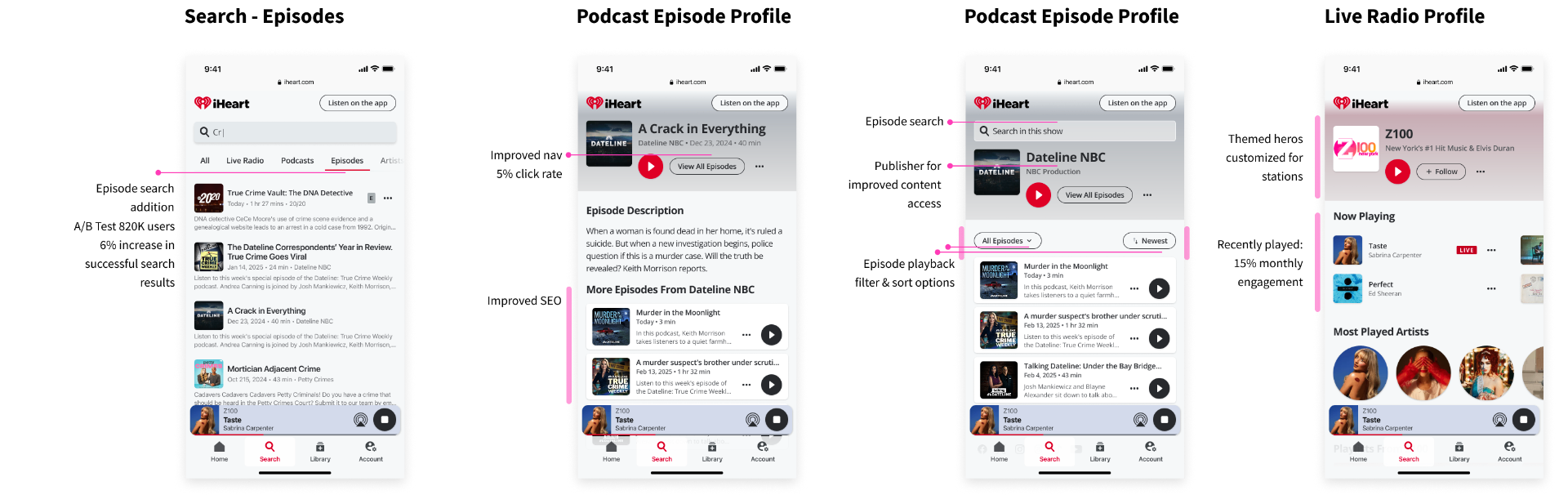
The redesigned experience delivered dark mode, a dramatically improved search, cleaner navigation, and a responsive design built for the 63% of users on mobile.
Results and Impact
Every metric moved in the right direction
- User Experience 4.3 out of 5 on SUPR-Q, measuring usability, trust, loyalty, and appearance across 50 participants.
- Engagement 30% increase in home page interaction and 60% increase in weekly website usage.
- Conversion Streamlined authentication and navigation increased conversion rates by 3%.
- Search Performance Successful podcast searches grew from 7.6MM to 8.4MM, a 1.6% increase.
- Development Efficiency Feature development timelines reduced by 50% for engineering and 15% for design.
- Dark Mode 46% of users actively chose dark mode, a strong signal of engagement with the new experience.